Tuesday, November 29, 2011

Exercise 10

In creating logos for the Linear Gallery I wanted to keep the mission statement of the gallery in mind along with the name and space that is the gallery. The top left logos are all logos that only contain the name of the gallery. In these iterations I wanted to give hierarchy to the word "linear" while incorporating lines. The next set of logos are on the top right. These connect the words linear and gallery while the again playing with lines and heirarchy. The bottom-most logos contain images along with words, intertwining the context of the gallery along with display a few renderings of the space of the gallery.

Tuesday, November 22, 2011

Exercise 9

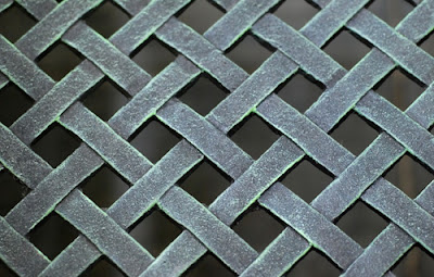
For this exercise, we used the model that we created for the last exercise and transformed it so that it could viably be outputted to a physical model. The first transformation is rather simple; I cropped part of the original model and illustrated the shadows that the objects cast so that they could be modeled on the tertiary plane that I originally created. For the second transformation I wanted to better represent the physical voids in the grating as they appear in real life, in a perspective view. I did this by extruding the top of the rectangular volumes into a diagonal shape above the grating. The third transformation is an exercise in further studying the space that the grating encapsulates. By making the grating into a cage, the texture and flowing shape that the metal is weaved into is further accentuated. Still, as with the previous models, there is a clear understanding of solid/void, however, the layering of the objects is lost. The fourth and final transformation is kind of a combination of the the first and second transformations, while the diagonals in the source image are highlighted by removing the field of rectangular volumes that were originally gridded among the voids in the grating.

Thursday, November 10, 2011

Exercise 8

My intentions for the model of the picture of a New York City sunset were to model the space that was given to me, while taking a few liberties in assuming how the street was set. Then, by lofting an object, I gave the void space that is created by the buildings a shape to illustrate this void. The shape is transparent so that you can see the extent of the model. I wanted to give this shape a free-flowing form because the void space is not clearly defined and can be interpreted in many ways. I then gave the skyscraper on the left hierarchy by rendering it a different color.


In this model of the grating pattern/texture I took a similar approach as in the last model. This picture gave me a better opportunity in modeling primary, secondary, and tertiary spaces. The grating is primary, while the void space created by the openings are secondary, and the background plane is tertiary. I chose to play around with the lighting in this model because of this reason and also because I believed that the overall structure of the model would give me a better opportunity for dynamic views.


Thursday, October 27, 2011

Exercise 6

For exercise 7 we were assigned to model a bay of the Linear Gallery in the Architecture Building to exact dimensions, proportions, material qualities, etc. Then, to put the bay into a greater context, illustrate it. My composition emphasizes the linearity of the space (obviously) and gives a better sense of how the bay can be used by students and visitors. The bay does a terrific job in letting in natural light through its many windows and I think that my model does a good job in showing the brightness of the space during midday. 

Thursday, October 20, 2011

Project 1 Revision

In this revision I decided to add transparent forms to emphasize the flowing negative space within the model. I also added a little more process drawings, showing how the letter is formed and how the two "e"s come together to create the final pattern and model.

Thursday, October 13, 2011

Project 1

Expanding upon my ideas in the last exercise, I improved my 3D models for more clarity and context of my process from exercise 1-6. Throughout the process I have analyzed a sans-serif version of the letter "e" from the word "architecture" seen on the left of my board. The font consists of circles and straight lines and almost appears to be drafted; this is a clever way to design a font meant to spell out architecture. Also, the letter is organized through three strong guidelines located at the top, middle (crossbar), and bottom. This idea is shown in my model through the crossing beams that connect the two sets of linked "e"s in my model. The "e"s link together by connecting the tail at its specified angle. Then, by repeating these shapes, the model starts to appear to be made of hollow cylinders with a bar through the middle that link at the top.

Exercise 6


Tuesday, October 4, 2011

Exercise 5

For exercise 5, we were assigned the task of taking our analysis of the past few exercises and constructing a  large composition that is visually and spatially pleasing. As you can see, the source material is located on the middle stripe of my 2d pattern and is highlighted in a bold blue color that draws your eye. Under the source word is the pattern in plan - transformed a little bit since the original composition was designed. I have included a hidden line view of the 3d pattern to more clearly illustrate how the letter "e" is being weaved throughout. I chose to include the bottom, rendered perspective to emphasize the "tunnel that is created between the "e"s and accented by the tan, guiding "beams".

Wednesday, September 28, 2011

Exercise 4 - 3D Pattern

For my 3D pattern, I decided to copy a small section of the pattern I previously made. The bars that run through the crossbars of the lowercase "e". I then extruded these bars upwards so that they stand out and clearly organize the pattern. Also, by adjusting the positions of the linked "e"s, I wanted to create a larger and more distinct void space. Finally, I split the tail of the top and bottom perimeter "e"s so that the pattern was organized inside of a square.

Axon - Rendered
Axon - Wire Frame
Axon - Hidden Line

Plan - Rendered

Plan - Wire Frame

Tuesday, September 20, 2011

Exercise 3

The initial form for this line weight pattern is two "e"s linked together by their tail ends. I wanted to illustrate my analysis of the e being linked together by it's crosspiece and each letter is like a link in the chain. There are three horizontal band located on the bottom, middle, and top to emphasize that the E is formed with three guiding lines in these places.
My grayscale pattern took the previous pattern exact and altered it by using transparency transformations. I added in the 3 scaled circles to over emphasize the circularity of the letter. I did this by placing the circles, selecting pieces of the letter, then changing their color.

Tuesday, September 13, 2011

Exercise 2

The concept behind this design is the rigidness of these Russian characters. The composition reflects this concept by creating a pattern of scaled squares which draw your eye to the center.
This font I found to be quite similar to the above one. Both stick to capitals or lowercases, respectively, however this font varies the height of it's letters with 3 datum. I found the spacing in this font rather important to the overall structure of each word and emphasized it by highlighting the area in between each letter with a spiraling pattern which reflect the curvature of the letters.

Sans-Serif - Clean


Sans-Serif - Raw


Serif - Clean


Serif - Raw


Gothic - Clean

Gothic - Raw